
One of the most asked questions in my design career, how to pick paint colors. From texts from family and friends to emails and insta messages, all asking the same questions. It seems easy right, like a color, buy a gallon or two and paint. If only it were that easy, it’s a bit more involved. Tone, finish, color are all decision factors. But don’t worry, a few tips and you’ll no longer be overwhelmed with paint selections.
TIP #1 – When to select your paint
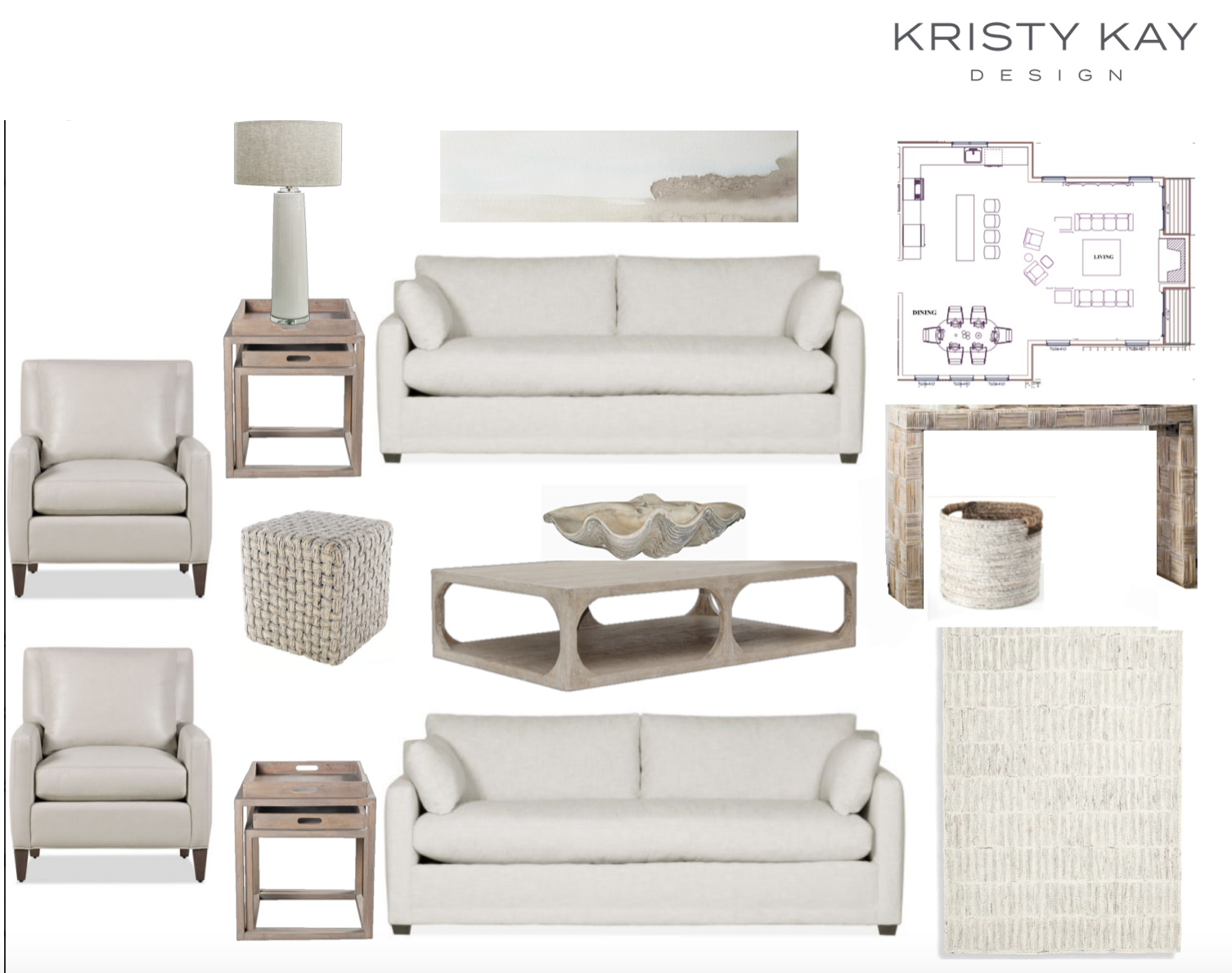
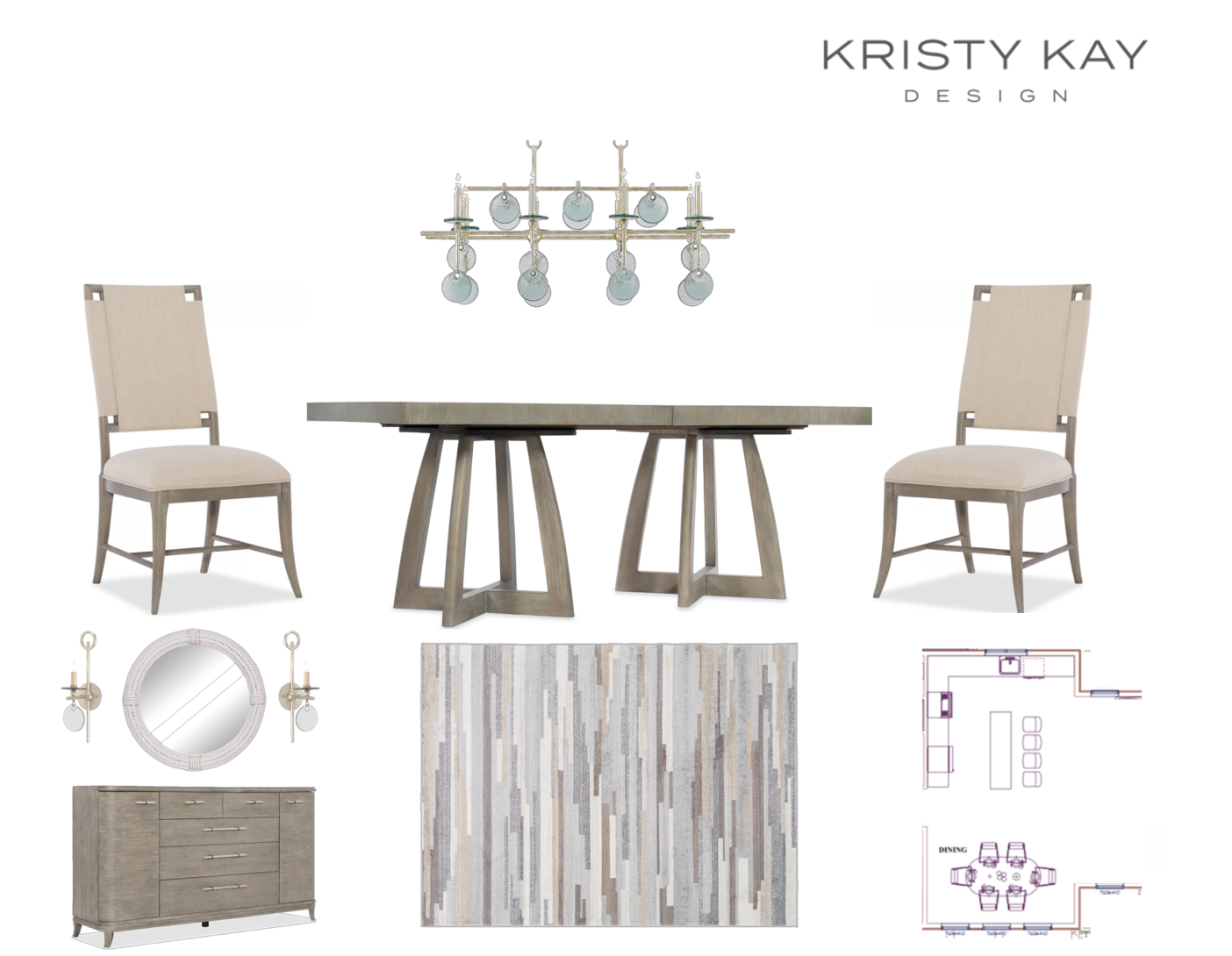
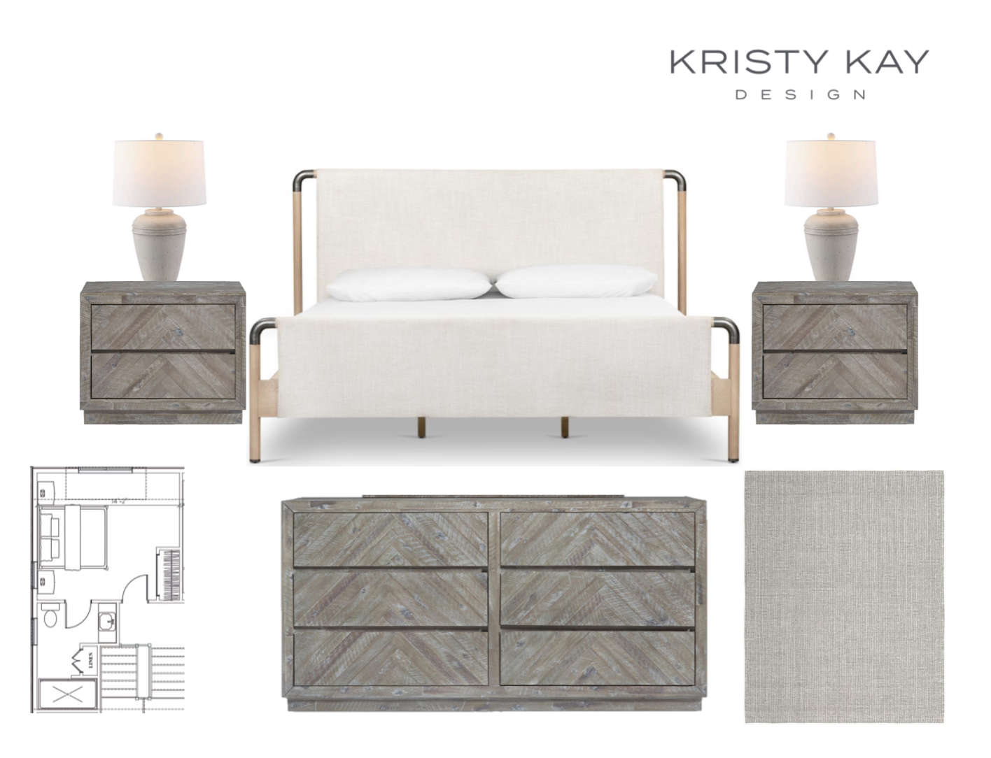
It’s simple, select your paint last. Yes, I said last. In the domino line up of building and renovating, selecting your paint should be last. Think about it this way, you agonize over details selecting just the right finishes like cabinets, tile, flooring, and then the time selecting your favorite rugs and furnishings. Would you pick a $50 gallon of paint and base your entire furniture plan on how it ended up looking on the wall? Definitely not. So again, once you have your finishes selected, and fabric swatches for your furniture, now is the time to lay everything out and see what you like for your walls and trim. In our design process, we often times build out the entire house before insulation and sheetrock are up. This let’s us “see” the design direction ahead so we are equipped once it’s time to select paint colors. Here’s an example of our design boards clients see and approve.
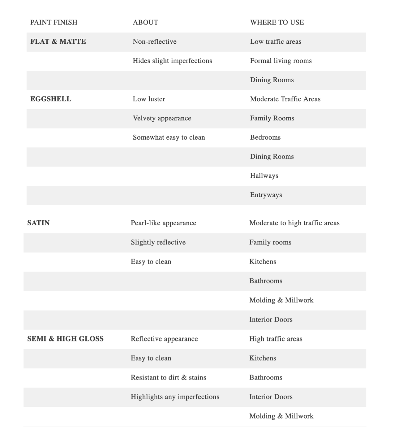
TIP #2 – Selecting the right finish
There’s a basic rule of thumb to follow when choosing paint sheens aka finish. The higher the sheen, the higher the shine — and the higher the shine, the more durable it will be. Flat paint has no shine; high-gloss is all shine. In between are eggshell, satin, and semi-gloss, each with its own practical and decorative job to do. Here’s a quick guide to break it down.
TIP #3 – TEST YOUR PAINT
I’ve said this a million times, and I’ll say it forever…you cannot tell until you test. And, I don’t mean a four inch spot on one wall, one evening after work. I test a ten inch square in three or four areas of the room. How the light will hit this area throughout the day and evening changes based on natural and ambience lighting. Paint and hardware stores sell small sample portions for as low as $2.50, it’s worth it. Buy a few and test. Look at your test areas at all times of day and lighting changes.
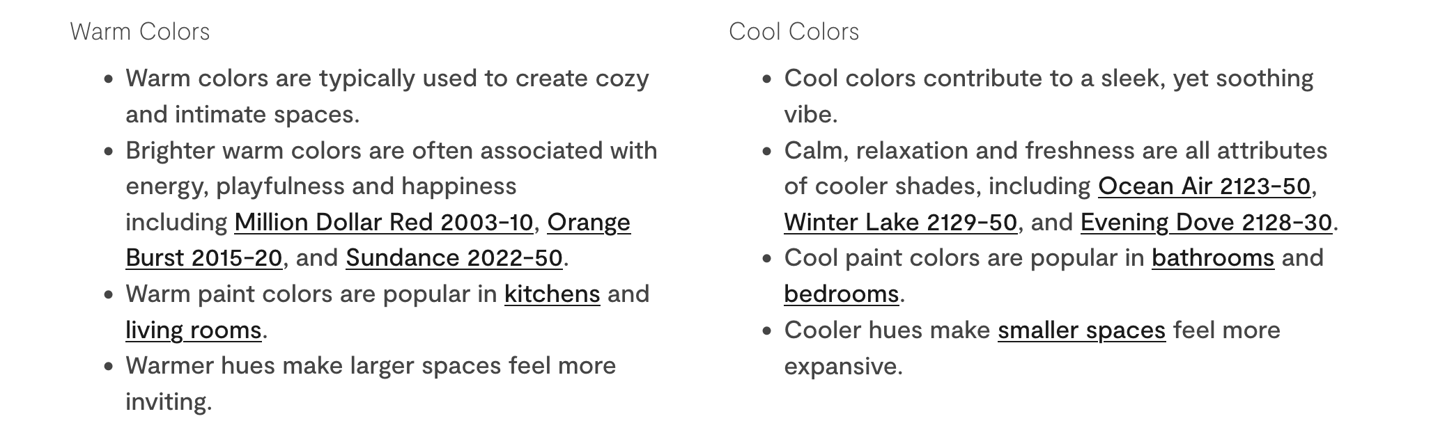
TIP #4 – Warm vs Cool
Warm colors—yellow, orange, red, and combinations therein—breathe energy, positivity and a sense of sunshine into any room. Cool colors—green, blue and purple evoke relaxation and calm. Worth mentioning are the 2023 design trends swinging back to incorporating some warmth in your spaces – think deep rich tones on cabinetry and even painted ceilings.
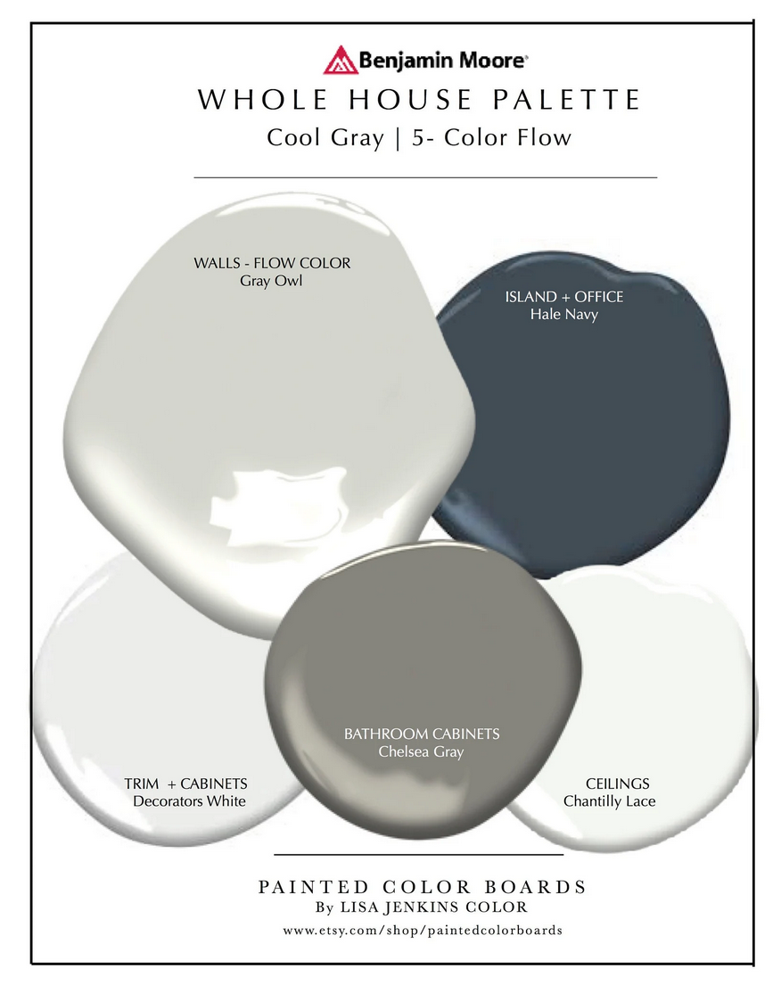
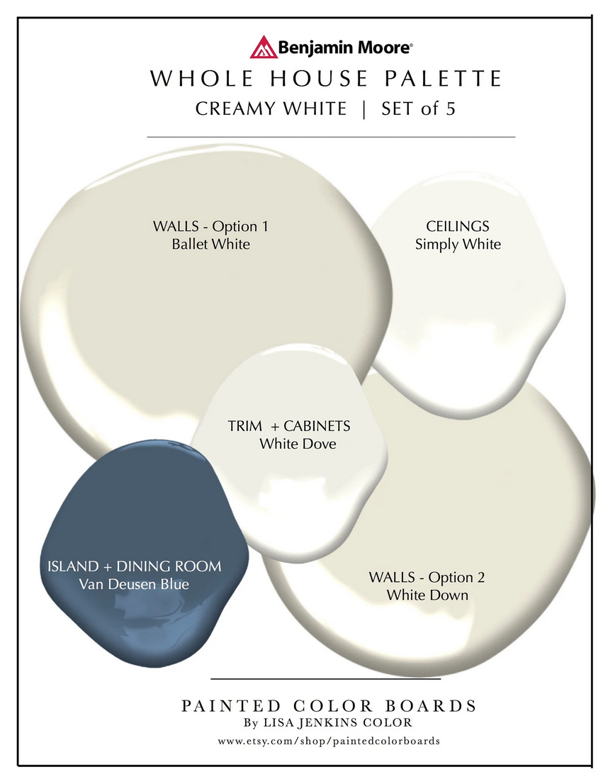
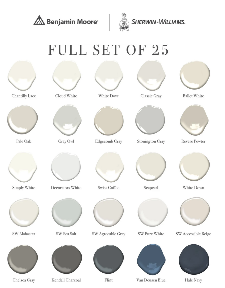
Neutrals like gray and white can also lean warmer or cooler depending on their undertones. This is the place I find most people ask questions. White looks, well white right? Nope. White can lean in a variety of directions depending on it’s undertones. Blue, Lavender, Pink, Cream…these undertones can really change the look and feel your going for. Here are a few visual guides and notes.
TIP #5 – How to select your colors
Now we’re ready for some fun. Time to pick colors. When I’m looking at my samples – let’s use a living room for example – I have a sample of my flooring material, a fabric swatch for the sofa and chairs, and a sample of the rug (DESIGN TIP – if samples aren’t available, order the smallest size the rug is available in often as small as a 2×3). Once I have these all laid out, I open the fan deck. What feels right in terms of tone? Now select 3 or 4 that you like against your samples. Once you’re comparing tones across your various samples, you’ll see immediately how some tones work together and some do not. I love the options on Etsy, businesses will send you prepainted boards and show you how colors work together taking a lot of the unknowns away!
TIP #6 – FAVORITES
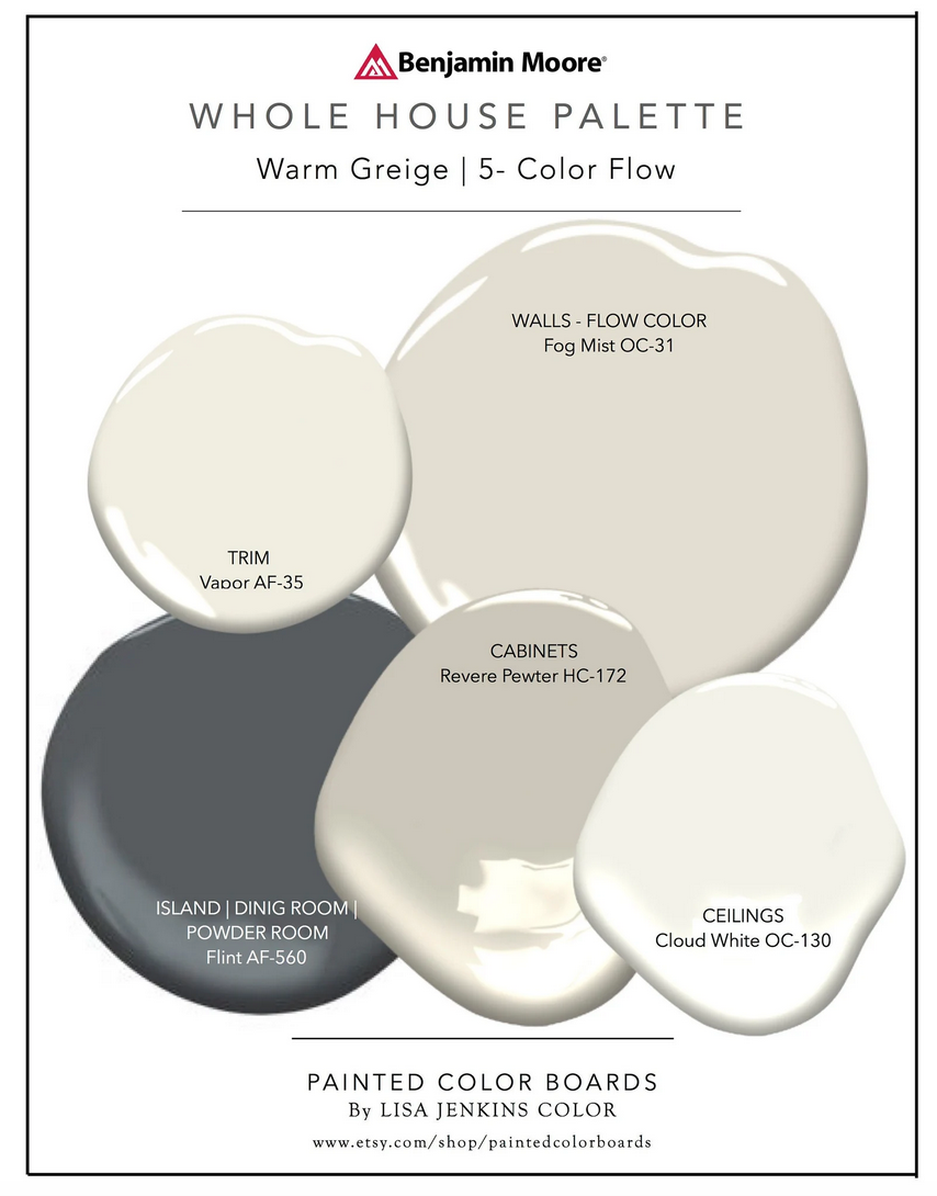
See below for a list of tried and true favorite paint colors! Last tip, think about where your colors start and stop. Enclosed rooms like bedrooms and bathrooms are easier with a clear, cased opening/entry way. Areas like foyers, kitchens, living rooms can all open onto each other. For these rooms, I prefer to select one color that flows through all of these spaces. If you opt for this, it makes your samples even more important as you’ll want to double check finishes like your kitchen cabinetry shade and any tile against your selections. Feeling bold? Look at your stone countertops and maybe there’s a lovely deep vein traveling through the stone, take this deeper color and repeat it somewhere like a powder room or dining room to help tie spaces together and give a bit of impact.

filed under
March 14, 2023
POSTED ON


