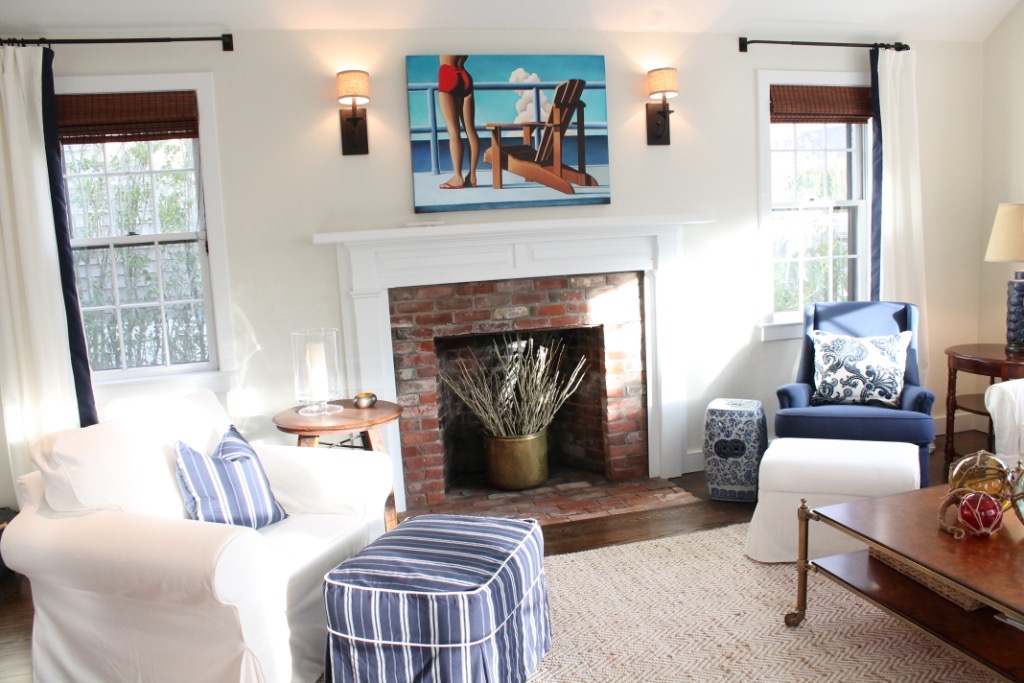
Wayfair.com asked me to reveal how I made the refined blue and white color scheme in this Nantucket summer home come together. But, I didn’t stop there. Read along as I shared designer tips and tricks for creating this “by the beach” look in your own home.
1. What were you trying to accomplish with the design of this project?
The design goal of this space was to create a classic look, but one that was family- and budget-friendly. It was a real story in high/low price points with a sprinkling of consignment and vintage pieces.
2. What was the inspiration for the project?
The inspiration for the project was vintage blue and white porcelain. A classic look found on Nantucket dating back to the shipping and whaling days.
3. How did you choose the color palette?
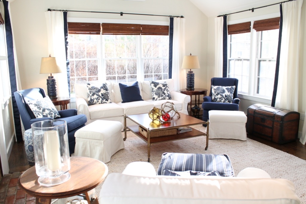
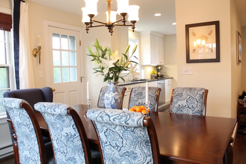
Mimicking the ornate patterns of blue and white porcelain, the palette became rich navy and bright white warmed by wood tones in cherry and mahogany, and balanced with subtle touches of black and brass. Given the intimate size of the home, it was very important that the rooms had a continuous flow both in color and style. The fabrics vary by room, but stay within the same color palette.
4. A lot of homeowners are concerned with purchasing a white sofa. What’s your take on this?
I love white sofas, with slipcovers that is. I find them VERY forgiving because they can be laundered anytime you need to get that bright, fresh, white back. I use them in my own homes and most projects, in fact.
5. What are your tricks for keeping a simple color palate interesting?
It’s all about layering. It was important to add warmth with wood and texture to the space. The woven Roman blinds behind the crisp white and navy drapes; the vintage wood trunk; the burled wood coffee table with warm brass accents; and of course, the pop of color in the art and glass fishing orbs.
6. What is your favorite part of the project and why?
My favorite part was the perfect high-low marriage within this project. The gorgeous Barclay Butera coffee table sits perfectly against budget-friendly white slipcovered sofas, Ikea drapes are adorned with a custom navy banding, and vintage pieces sit atop a budget-friendly 10 by 13 foot rug.
7. What are your tips for someone trying to recreate the look of this project?
My simplest tip would be to start with a palette and then don’t stray. The three repeating elements are navy, white, and warm wood tones. Patterns can all work together as long as the color tones remain the same. There are stripes, paisleys, and solid fabrics,and they all come together harmoniously.
8. How did you create this beautiful coastal look without using classic coastal elements, like seashells?
White instantly creates an easy breezy feeling; it always feels beachy. By using a white slipcovered sofa and white cotton/linen drapes, it was easy to build on a “by the beach” feel. Also, adding in woven textures like the sisal rug and Roman blinds helped continue the coastal feel.
9. What is your favorite designer trick?
My favorite trick is hanging draperies high and wide. It instantly makes a room feel lighter and brighter. More of the window is exposed by mounting the hardware wider than the window, and by going higher, you give the illusion of height to the room, too.
10. Finish the sentence: Every room needs ___.
Something black. I find black can ground any color scheme. In the living room, I used black in the sconces, on the trunk, and on the drapery hardware.
11. What is your best piece of advice for someone who is redecorating their home?
Start with the building blocks: What colors and what wood tone? Choose three colors to work with, but be careful here. Repetition is key. If you continue to introduce new colors and materials, it will quickly feel like a yard sale. Make sure there are at least three hits of the same color/finish throughout the room to maintain a cohesive design.
filed under
March 8, 2019
POSTED ON
